The Seattle Sounders have a new look. When the club initially announced plans to “explore a new brand identity” they vowed to come at it with an open mind. While a full rebrand was always unlikely, they promised to take in feedback that could lead to a subtle shift or a dramatic reimagining. The end result was somewhere in between.
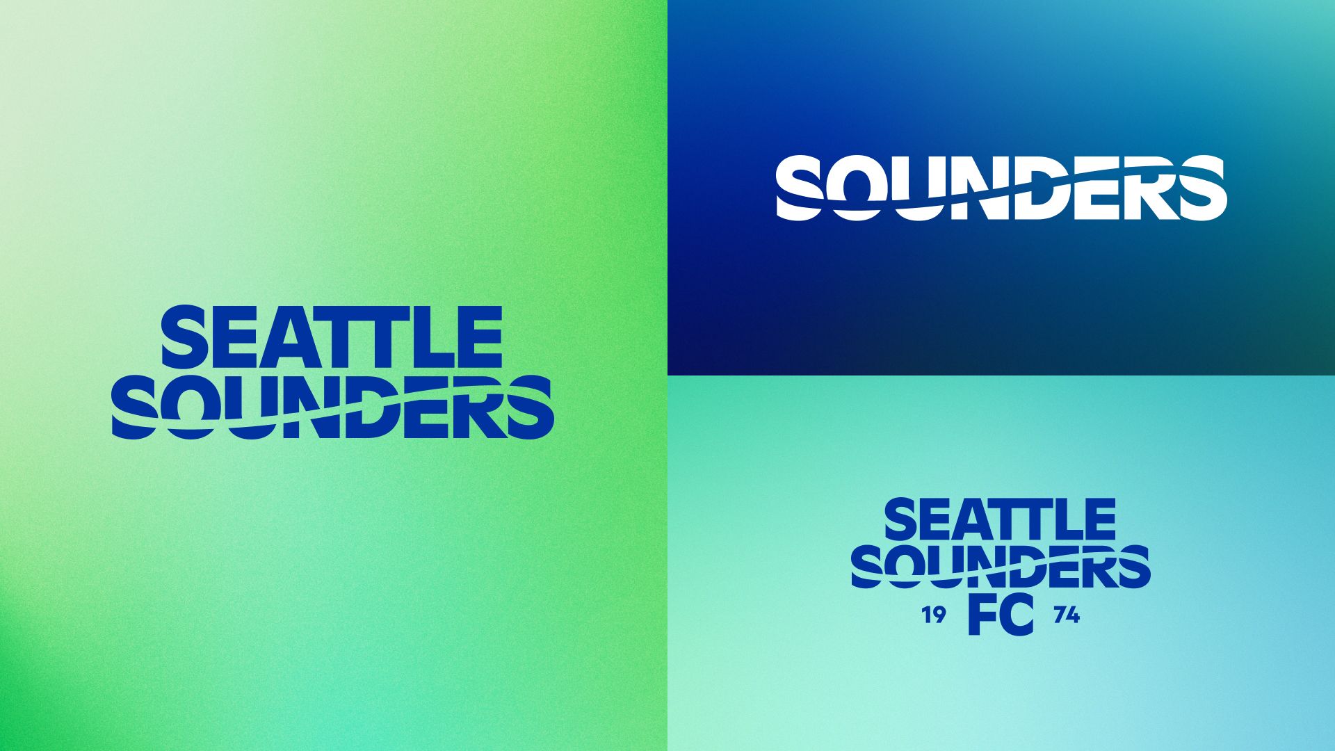
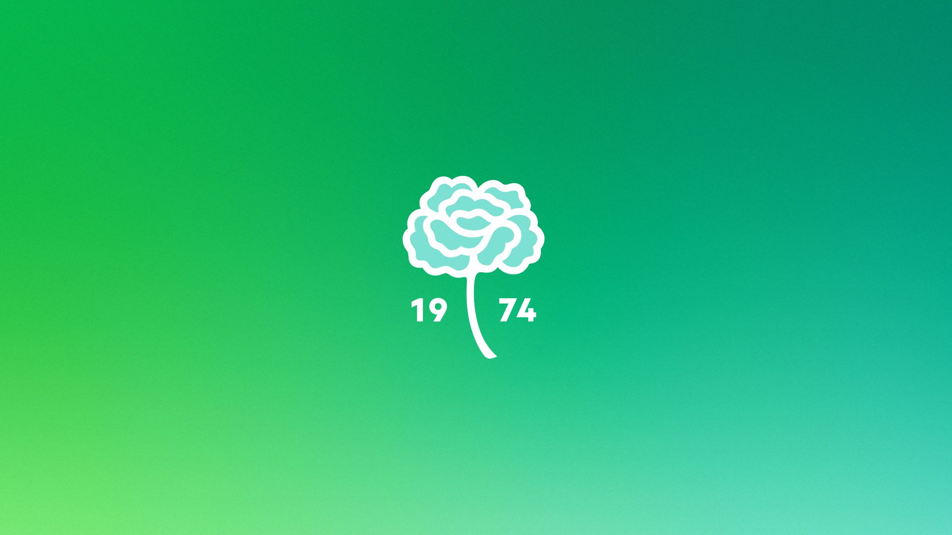
After collecting feedback from thousands of surveys, soliciting opinions from countless stakeholders and considering literally hundreds of iterations from multiple designers, the Sounders have settled on a new look created by the local firm Column that seems to strike a fair balance between familiar and updated. The Space Needle is still the main element, but it gets a slick upgrade; the colors are slightly tweaked while getting an expanded palette; and the only lettering on the badge is now a reference to the club’s founding in 1974. There are also a host of ancillary marks that formally add an orca and carnation to the family, along with updated word marks that utilize a fully customized font and features the trademark wave that had been a part of every pre-MLS logo.
“Today marks the culmination of much careful, contemplative and thorough work, and it is incredibly rewarding to now introduce Sounders FC’s brand evolution,” said Sounders owner Adrian Hanauer in a press release. “It was a dream achieved to bring the Sounders to Major League Soccer in 2009, but, like many of our fans, my love for the club started long before its MLS era. As Sounders, our past runs deep and proud, and that’s why we’re especially pleased to introduce this new visual identity, which isn’t so much a change as it is an evolution that more faithfully encompasses the entirety of the club. Every element in the brand now connects directly to our history. We are thrilled to continue building the Sounders legacy under our new crest as we celebrate our 50th anniversary and look ahead to the next 50 and beyond.”
Coming up on 50 years from the birth of the Sounders, the club has undergone a sort of transformation that many of us can relate to. They found a name that resonates with them and the people who love them a long time ago – they’ve flirted with changing things up, but nothing’s ever stuck – and while they’ve found a vibe that suits them over the years, not every part of how they present themselves fits what they’ve become. Looking in the closet, maybe some pieces have been outgrown; others just never really made sense and were more the product of an impulse to try to fit in or ride a trend than something they actually liked; and others were fine at one point but are firmly stuck in the early 2000s, are decidedly out of fashion, and frankly probably don’t really belong in the regular rotation for anyone of our stature.

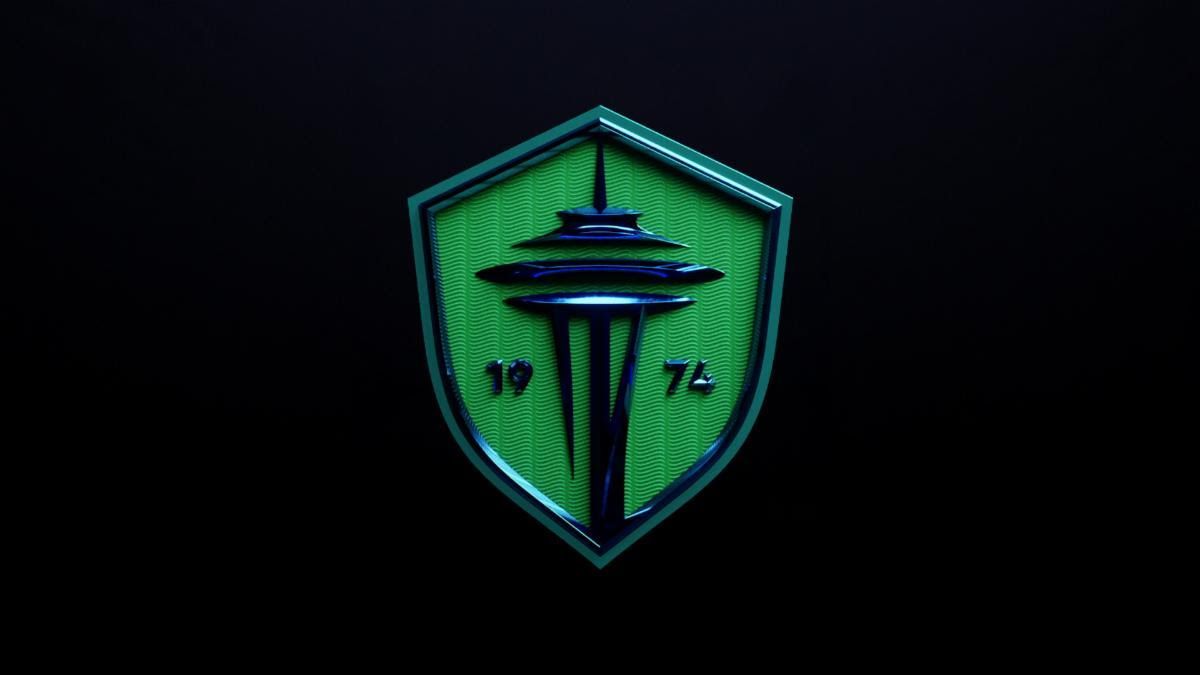
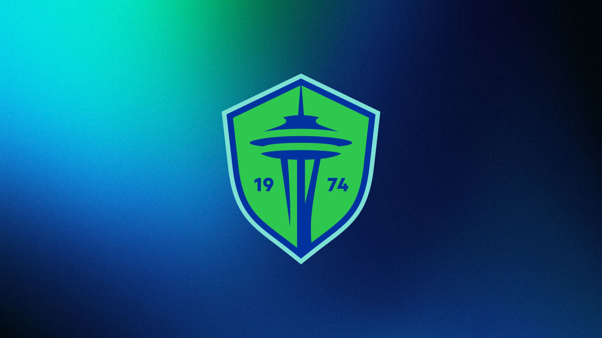
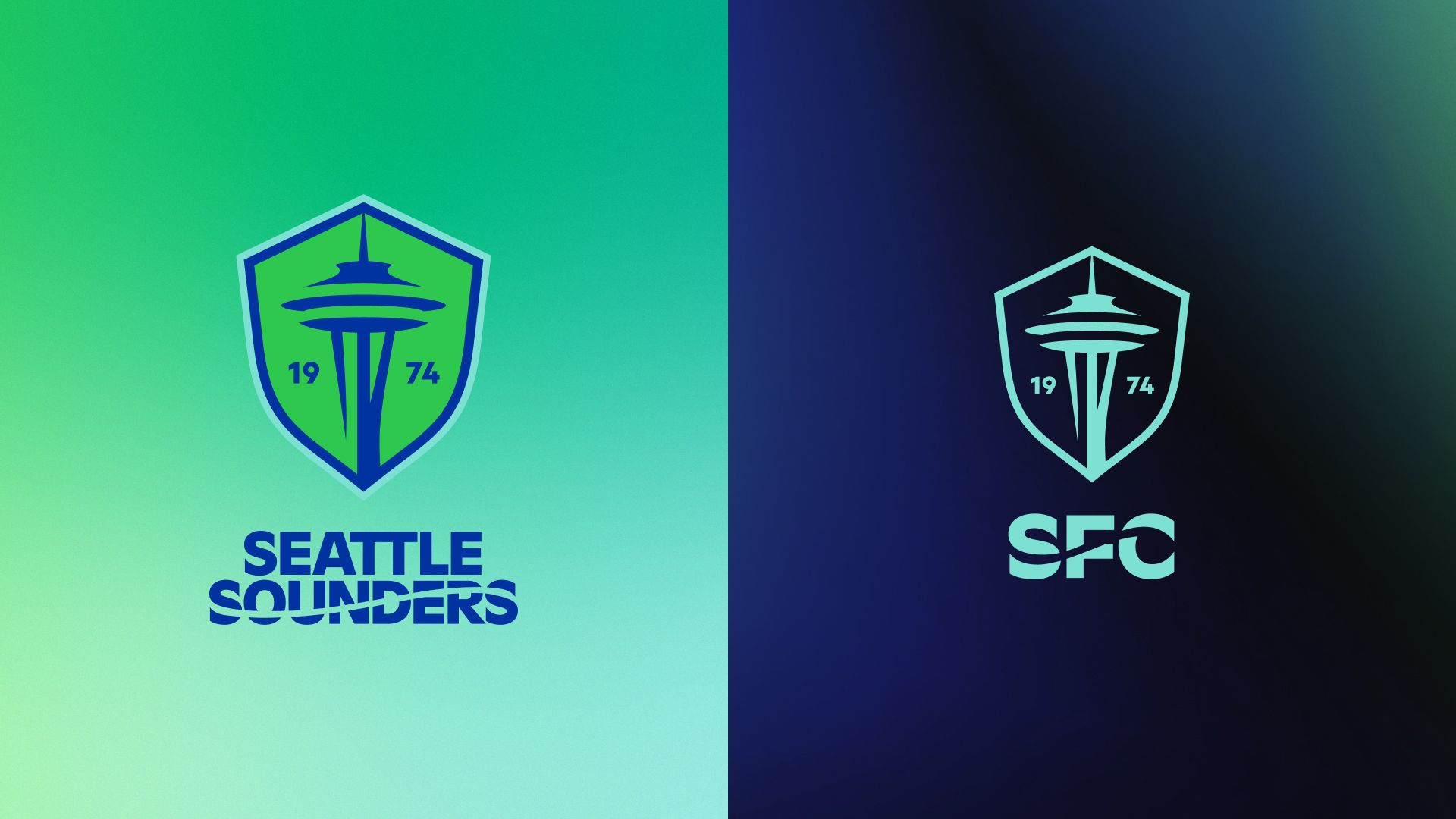
The resulting refresh gives a visual brand identity that more appropriately aligns with the identity of the club and its fans. The history of the Sounders is being embraced in a way that is completely counter to the design of the crest they’ve worn since they entered MLS. Rather than featuring the club’s name in the new logo, “1974” is the only text accompanying the simplified rendering of the Space Needle inside an updated Sounders’ shield, which still has a unique shape – if not quite as easily identified as a silhouette. During their exhaustive outreach, these were elements that were repeatedly highlighted by fans as part of what defines a “Sounder.”
“I believe the work we’ve unveiled today is good, but, more importantly, it’s rooted in good work,” said Sounders Chief Revenue & Marketing Officer Taylor Graham, who oversaw the process. “Since Day 1, the March to the 50th project has been driven by our community. The insights, strategy and design were all influenced by our fans, the Seattle community, our current and former players and more.”
The year’s importance needs no explanation to anyone with a passing familiarity with the club, and for anyone else it’s now one of the key parts of what will become the first point of introduction for the club.
Speaking of the shield, while the previous crest featured two different shield shapes overlaid to create one needlessly complicated shape, this new one reduces the noise by sticking with a single shape featuring two shades of blue. The interior line is Pacific Blue, and it’s not too dissimilar from the version of that color that the Sounders have used in the past, while the second – “Heritage Aqua” as it’s being called – harkens back to the shade of aqua used by the Sounders in the NASL days and previously used in the MLS era on the Heritage kit in 2017 and 2018.
Five decades later, you continue to shape our identity. ❇️ pic.twitter.com/VceC5g4yFs
— Seattle Sounders FC (@SoundersFC) September 26, 2023
The inclusion of Heritage Aqua as part of the primary color palette is the biggest change on that front, but the refresh also introduces an expanded palette that will allow for increased options when producing kits and merchandise – a welcome change for those of us who might be less inclined to include Rave Green in our everyday wardrobe – while also wrapping their arms around some other colors from the club’s past. This includes a range of greens from pastel to a sea green color that is probably as close to the green of the ’74 Sounders as we’ll get, given the Portland Timbers’ primary color.
The reworked crest does what needed to be done: it simplifies the existing concept and is executed well. It probably won’t satisfy those who would have rather seen the Space Needle removed entirely, but it addresses much of what was bad from a design perspective with the previous iteration. The new version is more adaptable because of its size and shape, but it’s also not meant to be used for every purpose or application.
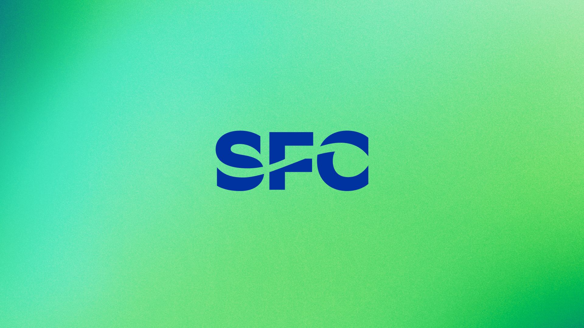
This is where the refresh really shines, in my opinion. It’s not just the new logo and colors, it’s a multifaceted design system similar to (and influenced by) the one designed for the Seattle Kraken. In addition to the crest there are also a number of new wordmarks, which all incorporate the wave element from Sounders logos of old. The wordmarks range from a maximalist version that includes the full name “Seattle Sounders FC” paired with 1974 to a paired down monogram version that simply features “SFC” with the wave through the letters. Those wordmarks can be paired with the crest in a number of applications from a full color version to simpler line versions, significantly expanding the potential ways that the marks can be used.
This club is a reflection of our community.
— Seattle Sounders FC (@SoundersFC) September 26, 2023
This crest is an illustration of our club. pic.twitter.com/cNT4E2InUq
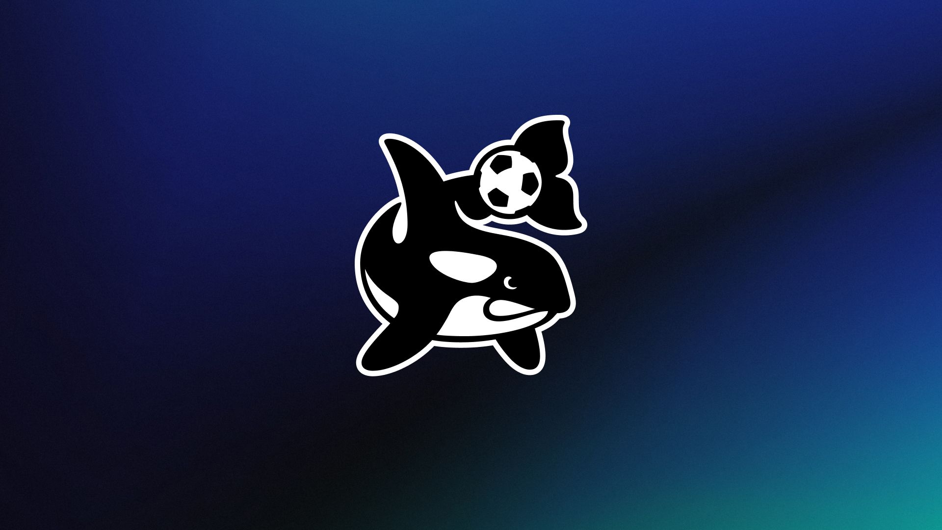
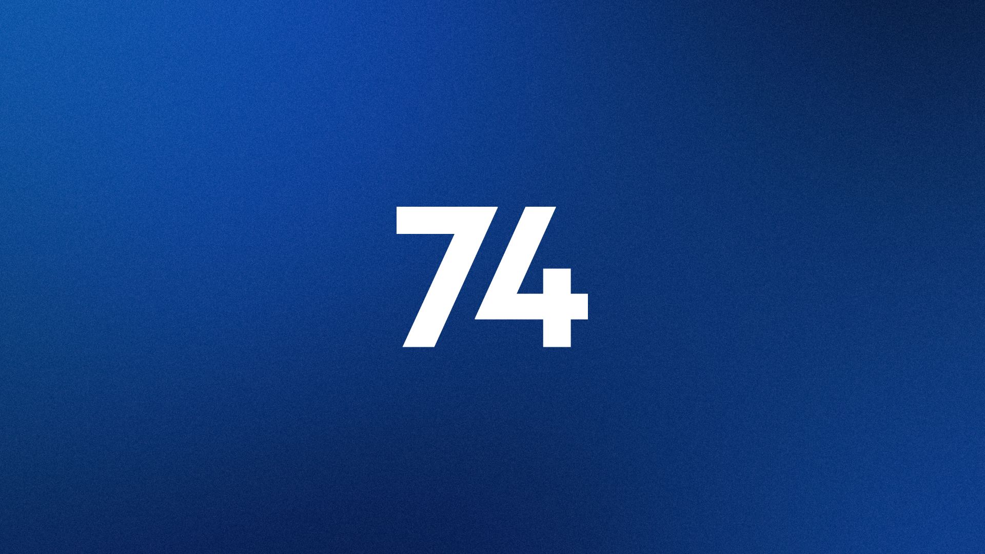
Beyond those, the design system also includes some really fun tertiary marks that we’ll probably see used to great effect on future merch and apparel. There’s a fun orca with a soccer ball, clearly paying homage to Sammy and the Sounders of the ’90s, as well as a carnation design that celebrates the club’s tradition of giving out the flower as a show of appreciation to the fans. This was one of the club’s first traditions, as players handed them out before games during the NASL era, and it has periodically returned – perhaps most famously in 2014 when they clinched the Supporters’ Shield on the final day of the season. Additionally, there’s a “74” mark that we’ll probably see used a lot in conjunction with a whole suite of logos and icons developed specifically for the 50th anniversary.
Those anniversary marks are all rendered in gold and include versions of the full-name wordmark, a gold version of the new crest with “Celebrating 50 Years” surrounding the design, and two other completely new designs. One mark utilizes the “74” placed in the center of a soccer ball, the design of which evokes the carnation, encircled by the words “Seattle Sounders - 50th Anniversary”. The other is simply the number 50, with a soccer ball replacing the zero.
Taken together, the refresh gives the club a new look that is updated and modern while embracing the rich history of the Seattle Sounders. While the previous crest holds fond memories for all of us, regardless of what you think of the design of it, it was intended and designed as a breaking point from that history and the fans forced the name to at least be carried into the future as a new era began.
It may take time to adjust to the new look, but I think the organization deserves credit for the work that went into this project, for going about it the right way, and for the end result. No matter what happens on the field, we are all the Sounders, and the Sounders are us. We are part of the history and the future of the club, and this new crest represents us as much as it does the players that we all cheer for game after game. This is something we can all be proud of.