Editor's note: The Sounders are expected to unveil their new crest next week. We dug this story out of the archives that gets into the thinking and process behind that. It was originally published on March 2, 2022.
When MLS first awarded an expansion team to Seattle, it was with the hope of building on the soccer culture of the region. It was not, however, meant to be a direct continuation of the legacy established by previous teams.
The Seattle Sounders had been a popular and reasonably successful team in the NASL and there was a more successful but less popular team in the USL playing under that name. In fact, Adrian Hanauer — a minority investor in the MLS team, who would eventually be named its general manager — had owned and operated the USL team since 2002. But continuing that legacy was not particularly front of mind in 2007.
It wasn’t that the idea of tapping directly into a region’s NASL past was literally unheard of at that point in MLS — the San Jose Clash had rebranded as the Earthquakes in 1999, albeit with different colors than the NASL team — but there wasn’t any track record of real success. Despite the 1999 rebrand, the Earthquakes struggled for market relevancy before going on hiatus while ownership decamped in order to start the expansion Houston Dynamo. Although the Earthquakes returned in 2008 when a local ownership group was found, the buzz around the team remained muted, at best.
So it wasn’t necessarily a surprise when the newly awarded Seattle MLS franchise offered up a ballot of potential names in 2008 that didn’t even include “Sounders.” Fans were asked to vote on Seattle Alliance, Seattle FC or Seattle Republic. Just before the name was put to a vote, the team added the option to write in a suggestion.
I suspect you know what happened next, even if you don’t know the specific details. More than half the ballots cast were for the write-in option, and about half of those write-ins were for some version of “Sounders.” That proved to be by far the most popular choice, beating the next most popular option by about 20% of the more than 14,500 ballots cast. The new team was christened “Seattle Sounders FC” as both a nod to that legacy and an attempt to differentiate it.
“We have heard the fans and are excited about moving forward,” then-majority owner Joe Roth said in a team release. “We are committed to building a team that will make the entire region proud. A team that will play with the same passion the fans have shown in selecting our name.”
At the same time that the Sounders announced their new, old name, they also unveiled their updated look. The MLS Sounders would have a completely modernized feel, with barely a reference to any of the teams with which they shared a name. The new colors were a bold “rave” green, accented by a “Sounder” blue and “Cascade” shale. The crest highlighted Seattle’s most iconic building, the Space Needle, and was embedded in two separate shields. The tall, skinny one was meant to represent the team while the shorter, fatter one was apparently for the fans. Laid across it was a wordmark banner that shouted the Sounders name.
It would be disingenuous to suggest the whole package was anything less than a massive hit. Buoyed by their record-setting attendance throughout their first several years, the Sounders also consistently ranked among the best-selling MLS jerseys. The distinct look had undeniably helped them push through the noise and made them stand out in what sometimes felt like a sea of sameness.
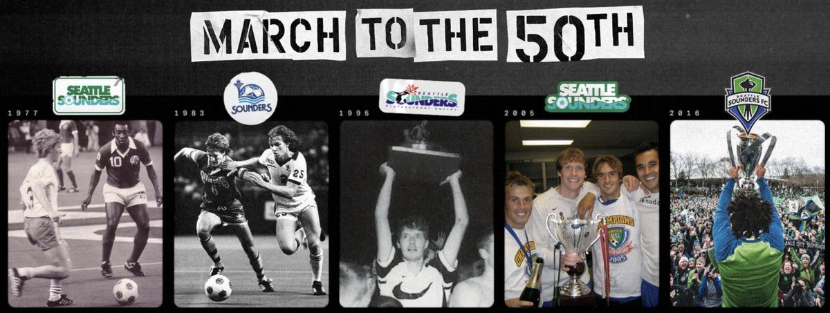
For all the success of the new look, it was also undeniably divorced from the Sounders’ history. Some 14 years later, much has changed about the organization. Once an afterthought, the Sounders now fully embrace their history and plan a massive celebration around what will be their 50th anniversary in 2024.
As part of that celebration, the Sounders are currently undergoing a self-examination of their visual brand identity that has been dubbed “March to the 50th”, which begins with a survey designed to identify what fans want their team to look and feel like.
“It’s celebrating 50 years and beginning to celebrate the next 50,” now-majority owner Hanauer told Sounder at Heart during YachtCon 22.5. “It’s sort of this acknowledgment that when the MLS-era Sounders were launched, we didn’t really think about the history; the history of visual representations was not taken into account.”
While openly admitting that he’s not really a fan of the current crest, Hanauer insisted that if fans feel strongly about keeping it, nothing will change.
“This won’t be an Adrian Hanauer decision,” he said. “I hope in this process our fans help us find something that works better, but if our fans love it, it stays.”
What’s wrong with the crest?
:no_upscale()/cdn.vox-cdn.com/uploads/chorus_asset/file/23243811/Medranda_Horizontal.jpg)
Hanauer’s personal feelings aside, the Sounders insist that changing the crest is not about taste. They say that this process is designed around elevating the club’s history and more directly tying that into its present.
I’ll get to that, but it’s still valuable to examine some of the elements that Hanauer points to as problematic and frankly drive me a little crazy, as well.
Spend even a few minutes examining the Sounders’ crest and a few things jump out immediately. The first is its shape. There’s no denying that it’s unique and can be easily identified by its silhouette. Why? Because it’s actually a bunch of different shapes layered onto one another.
Creating the outline are two shields and a banner. The shield that contains the Space Needle is normal-looking enough, if a bit oblong for my taste. The blue shield — the one that’s supposed to represent the fans — is like something out of a cartoon. All five of its points come together at odd angles, with weirdly bent edges and a shape that looks as though it’s being seen through a funhouse mirror.
The wordmark is even worse. Aside from it being a literal banner draped across the shields, there are at least two fonts being used, as evidenced by the “S’s” in Sounders and Seattle. There’s also a seemingly random use of embellishing serifs attached to the “U”, “D”, “R” and “F”, plus an odd notch in the “N.” If there was a design strategy beyond “it looks cool”, I can’t tell you what it is.
Even if you are unbothered by those possibly nitpicky criticisms, what makes the crest so frustrating are the proportions. Due to it being so vertical, it is hard to work with on a variety of mediums. Sure, it works as a crest, but it tends to look silly on a hat or emblazoned on a shirt. When paired with another team’s crest in a graphic, it invariably looks too small or too big.
My final criticism is admittedly more about personal taste: It just looks very much of the time it was created. The bubbled outline and shadowing of the Space Needle, the trapped white space, the layered outlines. We can disagree about how good or bad it all looks, but good design is about purpose and feels almost timeless. I don’t understand what any of the current crest is supposed to convey and it strikes me as dated.
The bigger picture
Maybe you find that criticism valid. Maybe you’re completely unbothered by it. What is undeniable, though, is that the current crest and broader visual identity say nothing about the history of the Sounders. The only time the Space Needle was included in a previous Sounders logo was in 1983, the final year of the NASL team’s existence. The colors, fonts and heraldic shield were all effectively brand new. There wasn’t even a passing reference to the Sounders’ wave, the one design element that had made its way into every previous iteration of the logo.
That’s the thing that most bothers Taylor Graham, the Sounders’ Senior Vice President of Marketing & Business Operations. More relevantly, Graham is the person who has been tasked with overseeing the “March to the 50th” campaign.
Graham is a California native but now proclaims himself a proud Seattleite after two separate playing stints with the USL Sounders, three seasons with the MLS team and a role in the front office since 2012.
“It’s 100 percent safe to say that the historical brand and visual identities of the original NASL and USL teams were intentionally disregarded into what the club became in 2009,” Graham told me during a recent interview. “The fans named the team in 1974. They named the team in 2008. I personally see this moment as that next place where our fans will influence the future of the club. Right now, we know, I believe, you believe, that this was a club born in 1974 and that hasn’t always been the case.”
Graham was one of seven players to make the move from the USL team to the MLS one. They were joined by coaches Brian Schmetzer and Tommy Dutra, along with Hanauer and a handful of front-office staffers. Together, they were able to ensure that some of the customs and traditions, as well as the team’s connection to the community, remained intact.
For all that connective tissue, the MLS team often attempted to present itself as distinct from previous iterations. References to the previous Sounders were mostly in passing, and even now the team doesn’t keep track of official stats from pre-MLS times.
Graham said he noticed a change around the time he joined the front office, when the team was deciding how much they should celebrate what would have theoretically been their 40th anniversary in 2014.
“It became this momentum because it was the right thing to do and what our fans were telling us,” Graham said. “It’s what we felt on match day. It’s the things we heard from Tommy Dutra and Brian Schmetzer and Jimmy Gabriel and all these people who chose to settle roots and stay in Seattle because of that connection. That is who we are today, but it’s not codified in our brand DNA. It exists because of the individuals and this is the exercise to embrace who we are formally, not only from a brand identity perspective but a visual brand perspective.
“We are in a very different place in 2022 than we were in 2009. When this came to life, it was before we played a single minute, before we won a singular match or before knew who we were and what this thing could be. We now have a lot of years of experience, some amazing successes and some incredible learnings along the way to evolve this.”
Built to last
Although unsaid, the obvious hope of the Sounders is to create a new mark that conjures both a sense of nostalgia and points to a glorious future. There’s also an acknowledgment that this is not an easy task and that you don’t need to look very hard to find examples of teams who botched this.
To get it right, the Sounders are focused on the process. It’s not enough to solicit feedback from fans — they want to hear from everyone who has an opinion. This won’t just be about voting on the design they like best, it will be deeper and multi-layered. They want to know what people like about the current mark and what they don’t like; what should be kept from the past and what should be discarded; the March to the 50th website is as much a vibe check as a questionnaire and is just the first part of the process.
If this feels a little “uncomfortable”, Graham said that’s a good thing.
“Rebrands are inherently loaded because they start from a place of design, instead of a place of soul,” Graham said. “What we’re talking about is the soul of this club and the soul of this community. If we can capture what those two things are and can understand what visual components represent those two things, that will be a really good place to be in. We’ve seen global soccer teams lose some rebrands. The premise of where we are starting is fundamentally different than some of those others. The premise of where we are is we’re embracing our history that weren’t contemplated at the beginning as opposed to moving away from them.
“I feel like that premise is very ‘Sounders.’ It feels uncomfortable. Uncomfortable is good. If there wasn’t discomfort we wouldn’t be looking ourselves in the mirror.”
The March to the 50th website has been taking feedback for a couple weeks and will apparently stay open a bit longer. Once it closes, the Sounders will go through the reams of data and try to make sense of it. Eventually, that will be passed on to the design firms they’ve contracted with and they’ll get to work on actual marks.
Even if they find out that fans really like the status quo, the plan is to at least add some secondary and tertiary marks — similar to Seattle Kraken’s multi-armed design system — to give the Sounders a bit more flexibility.
As for specific designs, that’s very much an open question. Short of keeping the crest intact, the Sounders seem open to the possibility of keeping the Space Needle at the center of the design. Maybe they bring back the orca in some capacity? Mount Rainier/Tahoma is probably the most visually striking and certainly the most timeless part of the Seattle skyline; is there a way to make that feel unique when the Vancouver Whitecaps and Colorado Rapids already use mountain iconography? Even though Rave Green is new to the MLS era of the Sounders has it become a core element of the current brand?
Personally, I love some of the designs I’ve seen from Jasmine Woo and think her fin-focused crest checks a lot of my boxes.
Oh, hey. I made some tweaks to my alternative Sounders FC badge.
— Jabbed Dubs+ #ynya (@jasminewoo) February 23, 2022
.
.
.#sounders#soundersfc#ebfg#SammyLives#ynya pic.twitter.com/ofs2U9idwW
As an amateur design nerd, I’m also just kinda excited about this process. I think it’s great that the Sounders are embarking on this journey and seem to be coming at with an open mind. I sincerely believe it’s a chance for fans to share their voice and be involved with something that should be around for at least another generation. At the very least, it’s a chance for us all to consider what we find important about a club’s identity.
“It doesn’t matter what’s right or wrong, it’s helping those things come to life,” Graham said. “As much as we are at a critical juncture for our club, our city is in the same place. Our community looks very different from how it looked in 2008. A crest is an illustration of this club. We need to be open to evolving and open to inputs from our fans and where this city is going.”