One of the elements that makes sports so compelling is storytelling. As fun as it is to watch the games, it's the discussion around them that make sites like this one so useful. The narratives might not always be important, but they are often what transform many of us from casual fans into sickos who are thinking about the team all the time.
If you're trying to understand the main reason why the Seattle Sounders felt compelled to update their entire visual identity, storytelling is the easiest explanation.

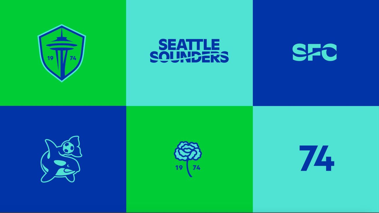
We saw that on full display during Tuesday's roll out. There were narratives surrounding virtually every element of the Sounders' new design system, 1974 being the only text on the crest, the history lesson attached to the carnation, and the wave that acts as a literal through-line combining the various eras of the team. Each element had its own story to tell, but more importantly, they can now act as a vehicle for telling many others. Even the new customized font will serve that purpose.
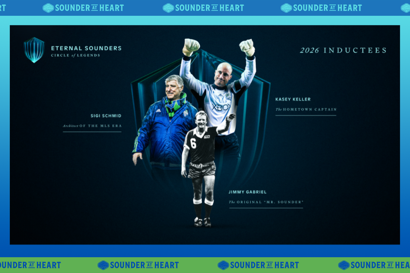
The final unveiling event of the day was also a good reminder of how much storytelling plays a part in forming the Sounders' current identity. As the Sounders prepare to celebrate their 50th anniversary, it's easy to forget that the MLS iteration of the team did not always fully embrace its full history.
It's now become part of the lore that when the team prepared to join MLS, several names were presented to fans as possibilities. They rejected all of those and overwhelmingly chose "Sounders" despite it not even being on the official ballot. But it really wasn't until the run-up to the team's 40th anniversary in 2014 that there was much attention paid to the pre-MLS history of the Sounders.
Tuesday's gala-style event was a sort of reminder that regardless of what the Sounders did in any official capacity, their history was almost inescapable. Among the hundreds of people who attended, were dozens of former players. Many of these former players still work for the Sounders in some capacity, as broadcasters, coaches or ambassadors. But many others simply live here, having either never left or making a conscious decision to return after retiring.
It's this type of story that the new visual identity will help tell.

I suppose now is a good time to admit that I’m biased when it comes to the Sounders’ current crest. I can’t tell you exactly when I first realized that I didn’t just dislike it, but might actually hate it. What I can tell you for certain is that the more time I spent looking at it, the more apparent its flaws became.
To say I was thrilled when I found out the Sounders were going to update their “visual identity” is probably an understatement. One of the biggest soccer brands in North America deserved to have a look to match. Say what you will about the old marks, I think we can all agree that they lacked any sense of gravitas or timelessness and were not particularly flexible.
Still, I understand that there were a lot of positive feelings wrapped up in that look and there was a good deal of concern about whether the Sounders would make things work.
With Tuesday's unveiling, I think we can say the Sounders have at least cleared those bars. The new shape of the primary crest is admittedly still growing on me, but I think they hit the mark in just about every way. The new look is both familiar and updated, the colors got a much-needed refresh and the new marks welcome additions to the family.
Whatever my feelings about the general look of the double-shielded crest, I think we can all understand how little connection it had to the Sounders' past. Everything from the colors to the shapes were totally new, the only nod to previous iterations being a name that was literally draped across it and could have just as easily contained something like "Republic" or "Alliance."
The new crest, I feel, rights those wrongs without completely throwing out what people identified with.

For all of its faults, the current crest has also built up its own story to tell. Tourist attraction or not, the Space Needle is an easily identifiable city landmark. Show its silhouette to almost anyone around the world and there's a good chance they can tell you what – and where – it is.
More than that, the Sounders have been building wonderful memories around that crest. They've won eight major trophies with it, more than any other MLS team in that time. Hundreds of players have worn that crest proudly, as have thousands of fans. Some of you have even gotten that crest tattooed on your bodies.
I'll also admit that when this process started, I was on team "No Needle." I wanted the Sounders to focus more on the natural beauties of our region than on something manmade. But a lot of you felt differently, and in hindsight I think you were probably right.
But even for those who might not feel a connection to the Needle, there's plenty here. The carnation might evoke memories of the earliest days of the Sounders in some or might just provide a new entry point for others. The orca is drawn from the team's A-League and USL eras, but doubles as a way to connect to our more youthful impulses. The wordmarks contain the wave that had been the one consistent element in the team's design until the initial MLS logo, while receiving a fresh hand-drawn look. There's a sense of duality in each of these, not quite one thing or another.
The important thing about the Sounders' new crest and every other element is not just that they look nice. It's that they provide entry points for fandom, connections to the club's past, present and future. They are a way for all of us to tell our own stories.